Writing a dissertation is more than just presenting facts. It’s about telling a compelling, credible story with your research. And nothing strengthens that story quite like the right visuals. Whether it’s a chart, graph, table, or infographic, visuals can simplify complex information, highlight key findings, and make your arguments more persuasive. But with so many options available, how do you choose the right one? .
Data visualization definition
Data visualization is representation of information and data in a visual format, such as charts, graphs, maps, or infographics, to make complex data more accessible, understandable, and usable. It helps reveal patterns, trends, and relationships that might be difficult to detect in raw numerical or textual data. Transforming data into visuals enables quicker comprehension, supports data-driven decision-making, and enhances communication across diverse audiences. Effective data visualization is a powerful tool for storytelling, analysis, and insight generation in academic and professional settings.
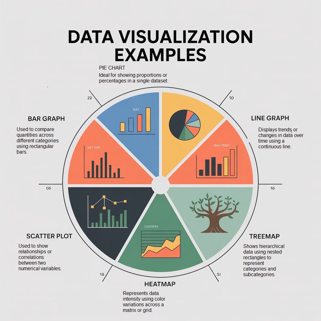
Data Visualization Examples
Bar charts
They are ideal for comparing quantities across different categories. They highlight differences, making them perfect for scenarios like showing the number of students enrolled in various academic majors such as Engineering, Business, or Arts. Their simplicity makes them easy to understand, and they effectively display the most significant and minor values in a dataset.
Line graphs
They are best suited for displaying trends over time and comparing multiple time series. For example, tracking monthly revenue over two years can reveal growth patterns or seasonal fluctuations. Line charts make it easy to identify upward or downward trends and allow for the simultaneous comparison of multiple datasets.
Pie charts
Visualize proportions of a whole, which are commonly used to show market shares or parts of a category. For instance, displaying the market share of different smartphone brands helps viewers quickly grasp relative sizes. While visually appealing and intuitive for small datasets, pie charts should be limited to a few segments to avoid clutter and confusion.
Map visualizations
Specifically, choropleth maps are excellent for showing geographic distributions and regional comparisons. For example, unemployment rates by state or COVID-19 cases by country can be visualized on a map to reveal spatial trends. These maps add valuable spatial context that highlights geographic differences.
Scatter plots
They are powerful for identifying relationships or correlations between two variables, such as studying the connection between hours studied and exam scores. They help visualize clusters, trends, and outliers, making them particularly useful in regression analysis and spotting patterns in data.
Histograms
They are designed to show the frequency distribution of continuous variables. An example is the age distribution of employees within a company. Histograms reveal the shape of the data distribution, whether regular, skewed, or bimodal, and help detect outliers and patterns that might require further analysis.
Heatmaps
They display intensity or frequency of values in a matrix format and are perfect for comparing large amounts of data at a glance. For example, website traffic by hour and day can be visualized as a heatmap to identify peak usage times. Color gradients make spotting trends and anomalies easier, especially in high-dimensional datasets.
Tree maps
Visualize hierarchical data through nested rectangles. They are often used to show budget allocations across different organizational departments. Tree maps help compare relative sizes while illustrating the hierarchy’s structure and proportion of parts.
Bubble charts
Represent three dimensions of data by plotting points with varying sizes. For example, countries might be plotted with GDP on the X-axis, life expectancy on the Y-axis, and population represented by bubble size. This multi-dimensional view allows for complex comparisons within a two-dimensional space.
Box plots (or box-and-whisker plots)
Summarize data distributions by showing medians, quartiles, and outliers. They are especially useful for comparing test scores across different classrooms or schools, clearly displaying data spread and skewness, and allowing for easy statistical comparisons between groups.
Area charts
Illustrate cumulative data over time and emphasize the magnitude of change. For instance, they can display the growth of user subscriptions over several months. These charts visually emphasize volume changes and are often used in stacked comparisons to show contributions of multiple categories.
Gantt charts
They specialize in project planning and tracking progress by displaying timelines for tasks. A software development project’s timeline is a typical example, showing task durations and dependencies. Gantt charts are invaluable for managing schedules, deadlines, and resource allocation.
Radar charts (or spider charts)
Compare multiple variables in a circular layout. They help evaluate skill levels across different competencies within a team. Radar charts provide an intuitive way to simultaneously see strengths and weaknesses across several attributes.
Sankey diagrams
Visualize flows or transfers between stages, making them ideal for showing energy usage and losses at various conversion points. They clearly illustrate how resources or quantities are distributed across processes, helping identify inefficiencies or bottlenecks.
Word clouds
Represent the frequency of words within a text dataset, highlighting the most common terms by size. They are popular for summarizing customer feedback or product reviews, quickly showing prominent themes and topics without requiring detailed reading.
Read on How to Choose a Good Dissertation Topic: A Step-by-Step
Steps in Data Visualization
Creating effective data visualizations in a dissertation involves more than just aesthetic charts—it requires presenting your research findings in a way that enhances understanding, supports your arguments, and withstands academic scrutiny. Here are the detailed steps to guide you:
1. Define the Objective
Start by clearly identifying the purpose of the visualization within the context of your research. Consider:
-
What question is the visualization helping to answer?
-
Which part of your dissertation does it support—results, discussion, methodology, etc.?
-
What insight or argument do you want the reader to draw from it?
Example: Are you using the visual to demonstrate a statistical trend, compare experimental groups, or highlight anomalies?
This step ensures your visuals are purposeful and directly aligned with your research objectives.
2. Collect the Data
Gather all relevant data from credible sources such as:
-
Surveys or experiments conducted during your study
-
Public datasets or academic databases
-
Institutional records or historical archives
Make sure your data is:
-
Reliable: From valid, unbiased sources
-
Complete: No missing values that could skew interpretation
-
Relevant: Directly tied to your research question or hypothesis
Note: Properly cite your data sources in your dissertation to maintain academic integrity.
3. Clean and Prepare the Data
Raw data is rarely dissertation-ready. You’ll need to:
-
Remove duplicates, inconsistencies, and outliers (with justification)
-
Handle missing data (e.g., through imputation or exclusion)
-
Format data into analyzable structures (e.g., numerical tables, coded categories)
-
Normalize or transform variables if needed for statistical analysis
Tools: Use software such as SPSS, R, Python (Pandas), or Excel for cleaning. Document each cleaning step in your methodology chapter.
4. Explore and Analyze the Data
Conduct exploratory data analysis (EDA) to discover:
-
Patterns or distributions that validate your hypothesis
-
Correlations between variables
-
Any unexpected findings that may require further explanation
This phase helps refine your understanding of the data and guides the selection of the most insightful visualizations. Visuals created here can be used in your dissertation’s Results or Appendices sections.
5. Choose the Right Visualization Type
Select the most appropriate chart or graph for your data and research goals:
-
Bar/Column Charts: Ideal for comparing categories (e.g., treatment vs. control)
-
Line Graphs: Best for showing change over time or trends
-
Pie Charts: Use sparingly to show proportions within a whole
-
Scatter Plots: Great for revealing relationships between variables
-
Box Plots: Useful in statistical comparisons and variability
-
Heatmaps: Effective for complex matrix or frequency data
Stick to visuals that enhance understanding. In academic work, clarity always trumps visual complexity.
6. Design the Visualization
Once you’ve chosen your chart type, design it with academic readability in mind:
-
Use neutral, accessible color schemes (consider colorblind-friendly palettes)
-
Ensure fonts are legible and consistent with the rest of the dissertation
-
Keep chart layouts clean and avoid excessive decoration
-
Label all axes, include units of measurement, and use legends wisely
Tools: Consider tools like Excel, SPSS, R (ggplot2), Python (Matplotlib/Seaborn), or academic-friendly software like GraphPad Prism.
7. Add Context and Annotations
Support each visual with the necessary context to prevent misinterpretation:
-
Use descriptive titles and figure numbers (e.g., “Figure 3.1: Monthly Revenue Trends”)
-
Include clear axis labels and units (e.g., “Revenue in USD”)
-
Add annotations or callouts to explain significant trends or outliers
-
Cite the source of the data below the chart if you didn’t generate it
Every figure must be discussed in the main text, usually immediately before or after the figure appears.
8. Review and Refine
Evaluate each visualization through the lens of clarity, relevance, and accuracy:
-
Does it support the research objective?
-
Is the design academically appropriate?
-
Is the message unambiguous?
Seek feedback from your advisor or peers. If you’re using complex statistics, consider a review by a statistician.
Revision is key to ensuring your visuals are publication-quality.
9. Share or Publish
In a dissertation, sharing happens via:
-
Inclusion in the Results and Discussion chapters
-
Placement in Appendices for large or supplementary visuals
-
Presentations during defenses or academic conferences
Make sure all visuals follow your university’s formatting guidelines (e.g., caption styles, figure placement, page layout)
10. Monitor and Update (If Ongoing)
Keep your visualizations updated before submission if your dissertation involves an ongoing study or evolving data set (e.g., longitudinal research). Ensure that the final versions reflect the most recent and complete data.
Document all changes transparently in your methodology or appendix sections to maintain research integrity.
The Pillars of Data Visualization
Data visualization is more than just creating attractive charts and graphs; it transforms complex, raw data into clear, compelling visual narratives that empower better decision-making and foster more profound understanding. The quality of a visualization depends on how well it adheres to a set of core principles, often referred to as the pillars of data visualization. These foundational guidelines ensure that data is not only seen but also truly understood.
Below are the seven essential pillars that support effective data visualization:
1. Clarity
At the heart of any good visualization is clarity. A chart or graph should communicate the intended message without confusion or ambiguity. Visual clutter, such as unnecessary decorative elements (often called chartjunk), detracts from understanding. Instead, aim for simple layouts with clearly labeled axes, readable fonts, and informative legends. The viewer should be able to quickly identify the key takeaways without needing to decode or interpret complex visuals. Clarity ensures that the message stands out above the medium.
2. Accuracy
A visualization must always reflect the truth in the data. Unintentional misrepresentations like distorted scales, inconsistent intervals, or cherry-picked data ranges—can lead to faulty interpretations and bad decisions. Maintaining your dataset’s integrity is critical throughout the design process. The visualization should accurately convey the underlying values and relationships, whether a bar chart, heat map, or scatter plot. Data should never be manipulated for appearance or persuasion; trust is built on precision.
3. Relevance
Every element of your visualization should have a purpose. This means selecting the most appropriate chart types, data points, and variables based on the question or audience. Irrelevant data can distract from the message and overwhelm the user. Relevance also means tailoring your visuals to the viewer’s level of expertise; what works for a data scientist may not be suitable for a marketing executive. Focusing only on what matters ensures that your story is focused and impactful.
4. Consistency
Consistency in design reinforces comprehension. This applies to colors, font choices, iconography, data formats, and interaction styles across multiple visuals or dashboards. When viewers encounter a consistent visual language, they spend less time decoding and more time understanding. For example, using the same color to represent a particular variable across multiple graphs prevents confusion and builds recognition. Consistency reduces friction and promotes a seamless user experience.
5. Aesthetics
While visuals should be functional first, aesthetics play a critical supporting role. A well-designed graphic draws attention, invites exploration, and can even evoke emotion. Consider using harmonious color palettes, appropriate font hierarchies, sufficient white space, and balanced composition to enhance your visuals. Aesthetics are not about decoration; they are about improving the viewer’s experience and encouraging engagement with the content. Thoughtful design choices can turn a plain chart into a powerful communication tool.
6. Efficiency
Time is valuable. Compelling visualizations allow viewers to grasp insights quickly and easily. This means reducing cognitive load by eliminating redundant information, organizing data logically, and using visual cues to highlight key findings. Techniques like color emphasis, callouts, or interactive filtering can direct attention to what matters most. Efficient visuals respect the user’s time and streamline the journey from data to decision.
7. Context
Data never exists in isolation. For a visualization to be truly useful, it must include the necessary context. This includes descriptive titles, explanatory annotations, source attributions, and time or unit labels. Even the most accurate and attractive visual can be misinterpreted or stripped of meaning without context. Providing context ensures that viewers see the data and understand its background, significance, and implications.


 Evan John